Our Mission
To revolutionise service management provision by removing the frustrations and limitations that have prevented service innovation for years.
Enabling self-sufficient teams to take ownership and rapidly adapt to changing service needs across any team and every part of an organization.
Logo
The Hornbill logo is the heart of our brand. Its shapes, lettering and colours represent our brand ethos and identify us in the world.
That’s why it’s so important to use the logo exactly as specified in these guidelines.
![]()
The Hornbill logo in full
Sizing
Never reproduce the logo at a size smaller than these recommendations, as it will result in loss of impact and readability, if you need a graphical representation of the brand at smaller sizes then use the icon.
![]()
The Hornbill logo should never be smaller than 100px in digital or 35mm in print.
Clearspace
In order to give our logo maximum legibility and exposure, please allow for an area of clearance around the entire logo. The logo Clearspace is the distance between itself and any other graphic element, this should be equal to the height of the logo .
![]()
Logo clearspace — Logo height = X
Icon
The Hornbill Icon should only ever be used in full colour and is designed to maintain brand identity at sizes where the full logo doesn't fit.
![]()
Logo use
Colours
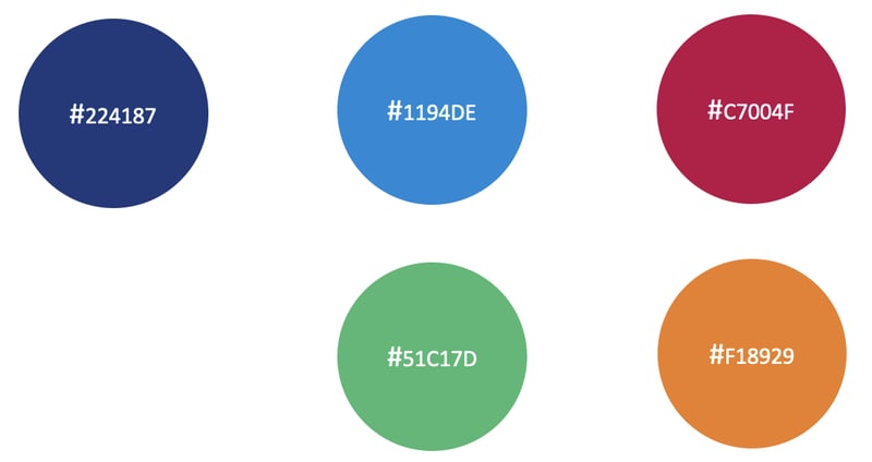
When used elsewhere, the 5 primary colours used in the Hornbill logo are most suited to attracting attention to things of importance, adding vibrancy & enhancing identification, e.g., between Hornbill applications.
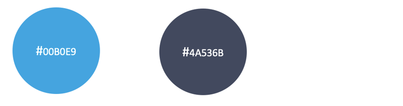
Secondary colours add depth to designs & define specific campaigns or projects.
Primary Colours
Secondary Colours